


Proyecto: Diseño de identidad visual
(ESP)
Identidad Visual de MOE: Elegancia en Cada Detalle
La marca MOE se define por el lujo y la feminidad, y su identidad visual es un reflejo directo de estos valores. El logotipo es una declaración de estilo, con la palabra “MOE” en una tipografía elegante. La letra “O” se transforma magistralmente en una rosa en flor, que no solo es un símbolo de belleza y pasión, sino que también se convierte en el icono principal de la marca.
Los colores seleccionados para la marca —negro, dorado y rojo— son tan audaces y poderosos como la mujer MOE. El negro representa sofisticación y misterio, el dorado añade un toque de opulencia y el rojo, vibrante y lleno de vida, aporta una energía que captura la atención.
Esta identidad visual no es solo un logotipo, es una promesa de calidad y diseño excepcional. Cada prenda de MOE lleva consigo la esencia de la rosa, simbolizando el cuidado y la atención al detalle que la marca dedica a cada una de sus creaciones.
(ENG)
MOE Visual Identity: Elegance in Every Detail
The MOE brand is defined by luxury and femininity, and its visual identity is a direct reflection of these values. The logo is a style statement, with the word “MOE” in elegant typography. The letter “O” is masterfully transformed into a blooming rose, which is not only a symbol of beauty and passion, but also becomes the main icon of the brand.
The colors selected for the brand – black, gold and red – are as bold and powerful as the MOE woman. Black represents sophistication and mystery, gold adds a touch of opulence and red, vibrant and full of life, provides an energy that captures attention.
This visual identity is not just a logo, it is a promise of quality and exceptional design. Each MOE garment carries with it the essence of the rose, symbolizing the care and attention to detail that the brand dedicates to each of its creations.

Identidad visual
(ESP)
Idea detrás del proyecto:
El diseño del imagotipo es simple pero efectivo, busca denotar elegancia y calidad además de un toque femenino clave en el concepto, la palabra moe significa sueños en hawaii, a lo que se hace referencia en el icono principal de la marca la letra O.
(ENG)
Idea behind the proyect:
The logo design is simple but effective, it seeks to denote elegance and quality as well as a key feminine touch in the concept, the word moe means dreams in Hawaii, which is referred to in the main icon of the brand, the letter O.
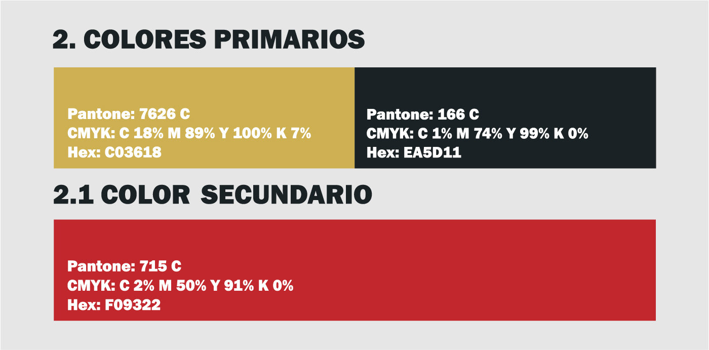
Paletas de color y usos
(ESP)
Paleta de color:
Los colores principales de la marca son el negro y dorado, ya que son colores que demuestran elegancia a simple vista y con los cuales se puede trabajar bien todo lo relacionado a crear un status alrededor de la marca. mientras que el secundario es un rojo muy característico que busca llamar la atención y hacer juego en entornos publicitarios.
(ENG)
Color Palette:
The main colors of the brand are black and gold, since they are colors that demonstrate elegance at first glance and relates to create a status around the brand.
while the secondary is a very characteristic red that seeks to attract attention and match advertising environments.
while the secondary is a very characteristic red that seeks to attract attention and match advertising environments.


